Building Verdafin — A Green NBFC for the Future
Brand Strategy + Identity + Print + Digital
The Mandate
Verdafin was envisioned as a new-age NBFC operating at the intersection of finance and sustainability—supporting sectors such as renewable energy, electric mobility, and green infrastructure.
The task was to create a brand that could establish immediate credibility within the financial ecosystem, while clearly signalling its role in enabling sustainable growth. It needed to speak with authority to developers, institutional partners, and investors— balancing rigour with relevance.
This was not about entering the NBFC category.
It was about shaping a more progressive version of it.
Strategic Foundation
At its core, Verdafin is a capital enabler—built to fund and support the next generation of sustainable businesses.
The brand therefore needed to express:
•
Financial strength and long-term reliability
•
A strong commitment to sustainability and responsible
growth
•
A disciplined, future-focused approach to business
expansion
We defined a positioning that moves away from conventional NBFC language—towards something more contemporary, while retaining the seriousness and structure expected of a financial institution.
Naming the Brand
The creation of Verdafin was central to the engagement—and one of its most complex aspects.
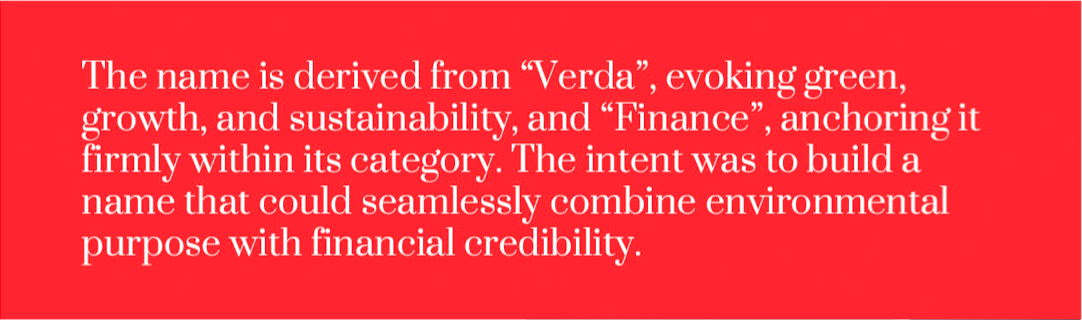
The name is derived from “Verda”, evoking green, growth, and sustainability, and “Finance”, anchoring it firmly within its category. The intent was to build a name that could seamlessly combine environmental purpose with financial credibility.
Achieving this balance required extensive exploration. The name needed to be distinctive, easy to recall, and globally relevant—while also navigating the practical constraints of trademark availability and digital ownership. A rigorous process of linguistic evaluation, trademark screening, and URL validation was undertaken to ensure the name could be both protected and scaled.
Verdafin ultimately reflects a clear and focused idea — a financial institution aligned with the future of sustainable growth.
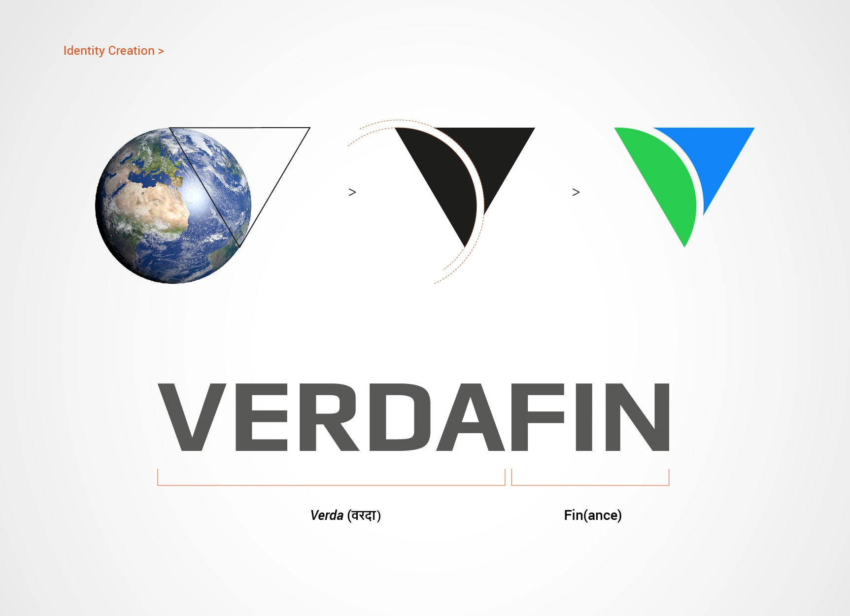
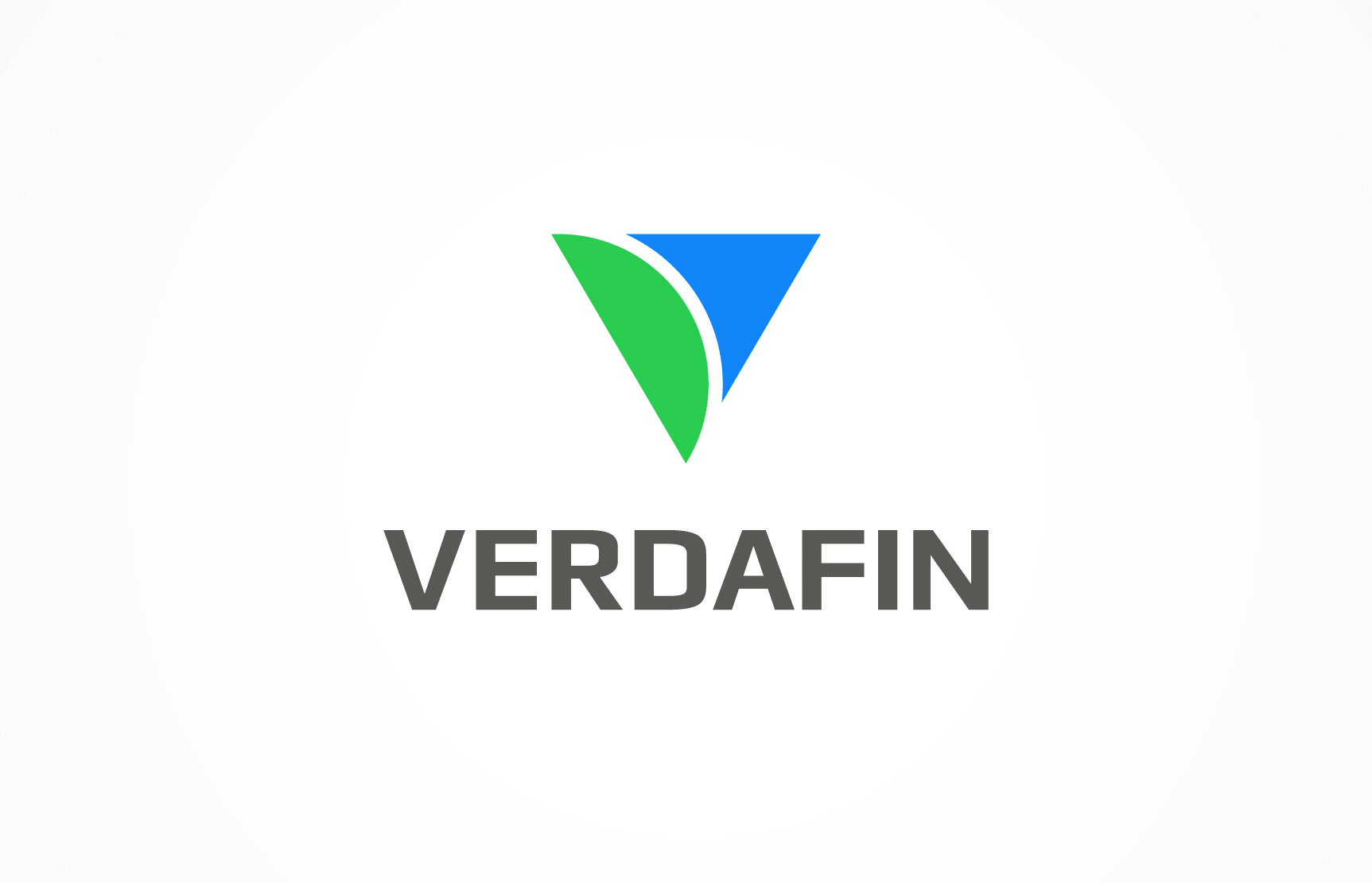
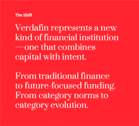
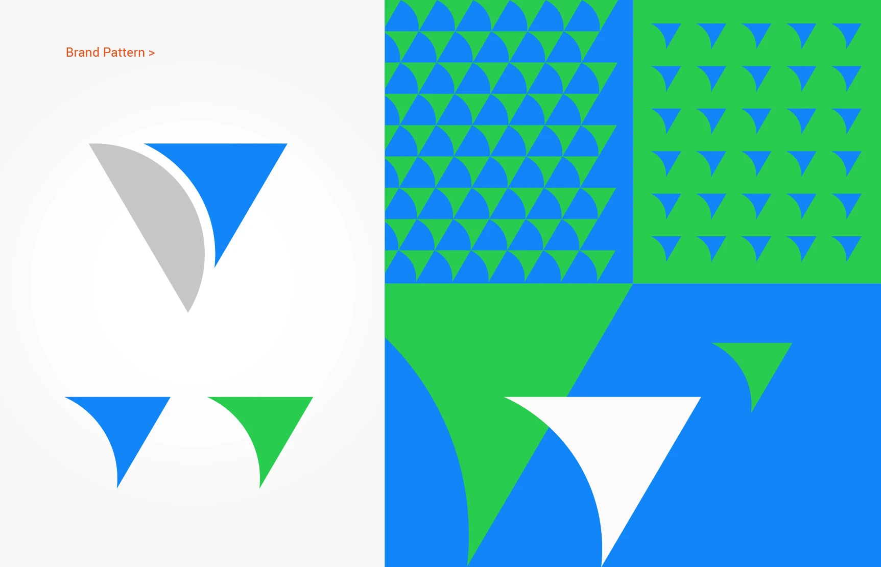
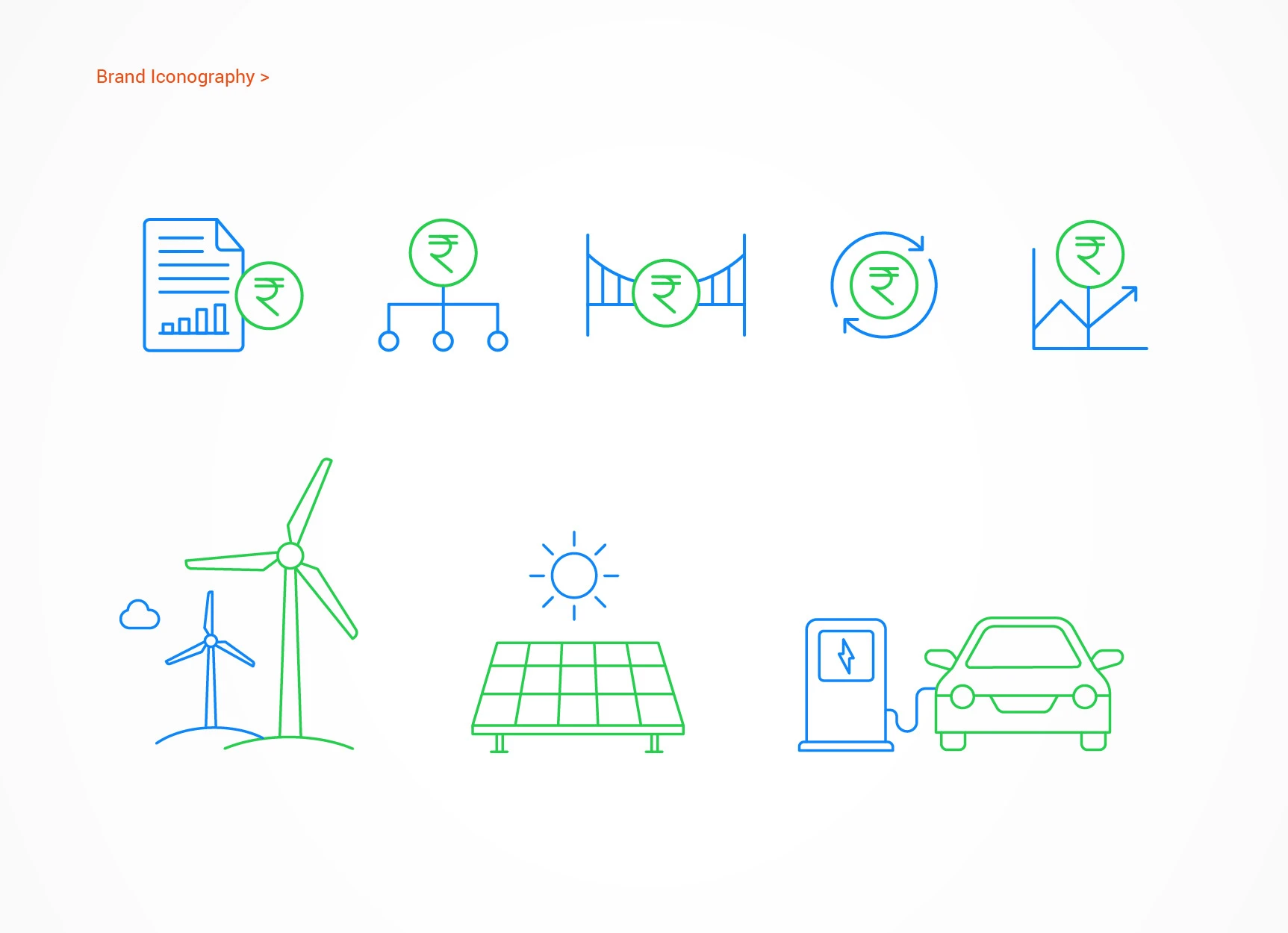
Identity System
The identity was designed to translate this idea into a coherent visual language—one that signals trust, clarity, and forward movement.
In a category often dominated by either overly corporate or overly “green-coded” expressions, the approach was to strike a deliberate balance. The identity avoids clichés of sustainability, instead adopting a more refined and structured aesthetic that reflects financial discipline.
The system is built on:
• Clean, controlled typography that conveys authority and
precision
• A restrained yet distinctive colour palette that signals
sustainability without overstatement
• A visual language that feels stable, modern, and scalable
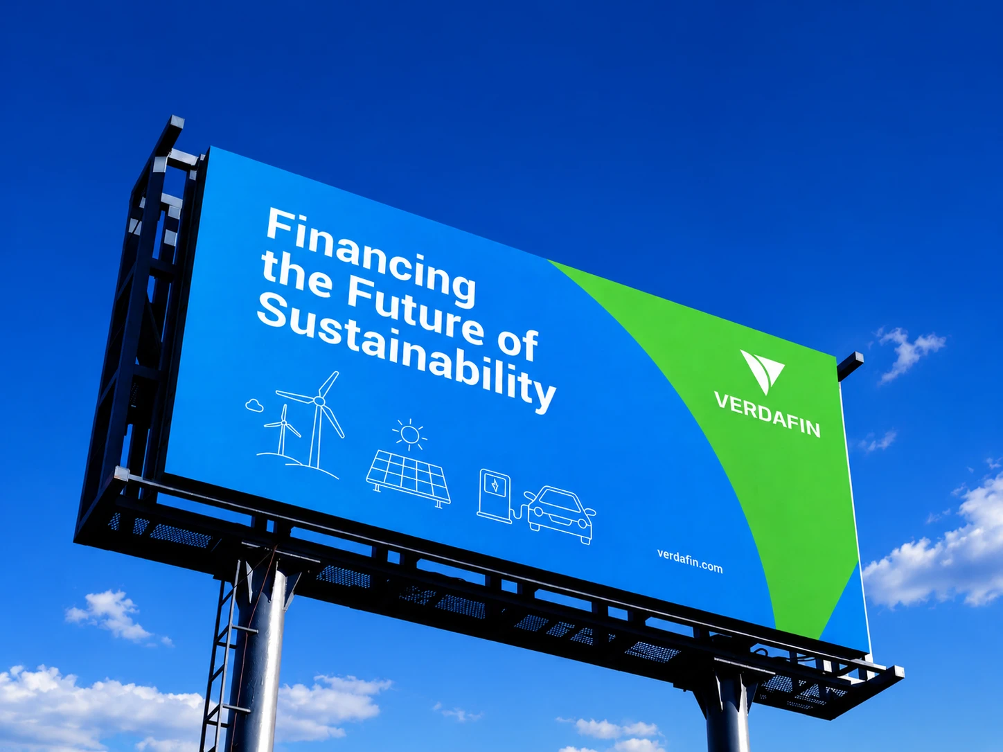
Every element was designed to perform across investor communication, corporate materials, and brand environments—ensuring consistency and credibility at every touchpoint.
The result is an identity that feels institutional, yet progressive. Grounded in finance, yet aligned with change.
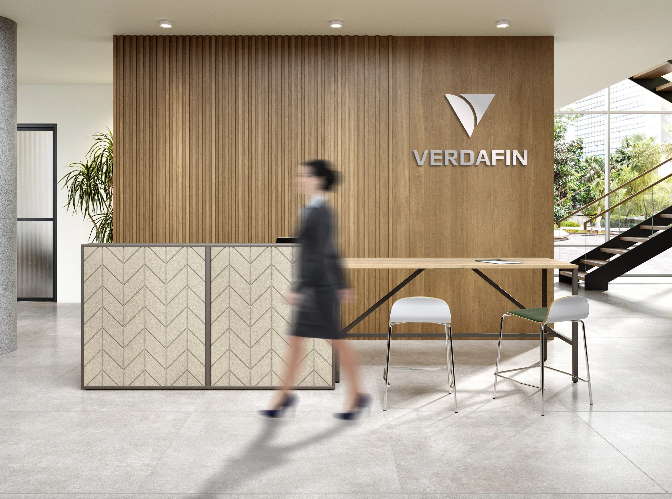
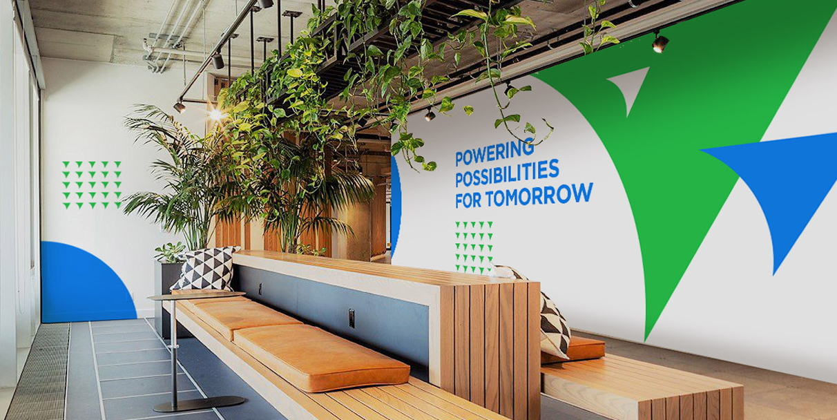
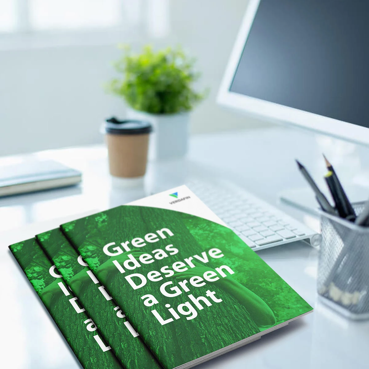
Extending the Brand
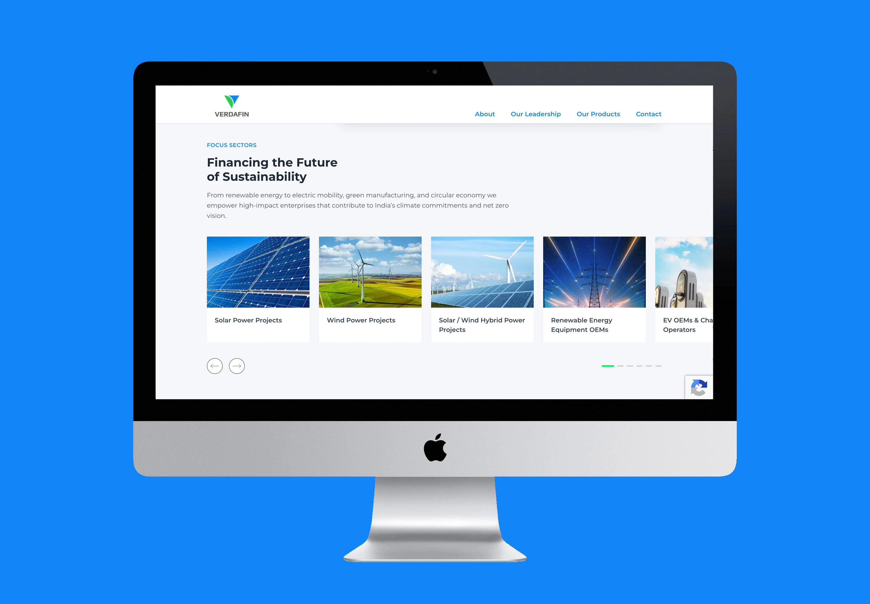
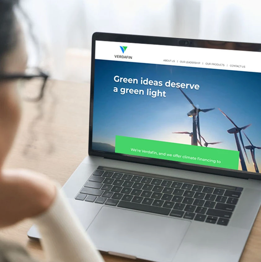
The identity was extended across key communication touchpoints to ensure a consistent and cohesive presence. Messaging, visual systems, and brand applications were aligned to reinforce the same core idea—of finance enabling sustainable progress.
The website, while important, was approached as a supporting layer—translating the brand into a clear and accessible digital interface. The focus remained on clarity of communication and ease of navigation, ensuring that the platform supports the brand without overpowering it.