Introduction
When people think about branding, the first thing that comes to mind is logos, colours, or taglines. But there’s another powerful element that quietly shapes how your brand is perceived.
That is typography.
The fonts you choose, how they’re styled, and how consistently they’re used can significantly influence how your audience feels about your business.
From conveying professionalism to evoking creativity or trust, typography in branding plays a major role in building a strong visual identity making it a crucial element for any branding agency in India aiming to create impactful and memorable brand experiences.
It’s about communicating your brand’s personality.
In this blog, we’ll explore how typography impacts perception and share practical tips for effectively choosing typography for your brand.
What is Typography in Branding?
Typography defines the artistic nature of text's style, arrangement, and appearance of text. This includes the fonts you select, the sizes of those fonts, the spacing used in between letters and how you align those letters.
Good use of typography in branding will enhance clarity and consistency across all platforms; your website, your social media profile, your product packaging and your advertisement.
Developing a good brand guide typography ensures that your brand's typography remains consistent, which will ultimately lead to your brand being more recognizable and professional.
Why Typography Matters in Branding
Typography directly influences how your audience perceives your brand.
1. Creates First Impressions
The type of font used by your brand can quickly convey its character as either modern, classic, youthful, or serious in nature. A well-designed brand identity typography will establish the character of the brand before any of the text has been consumed.
2. Builds Brand Recognition
Using the same typography in branding consistently helps your customers recognize your brand better over time, associating specific identifiers (such as letters and logos) with your brand.
3. Enhances Readability and User Experience
Using clear, easy-to-read typography can help customers have better experiences using your products. Readability is an important aspect when choosing typography for your brand and how that will impact user engagement.
4. Communicates Brand Personality
Typography is essentially a visual representation of a brand's personality or message. For example, a bold, clean typography in branding may convey confidence whereas a script typography can be viewed as elegant or creative.
Therefore, including typography in your brand's style guide is critical to maintaining the tone of voice for your company's image and identity.
Types of Typography and Their Impact
Different font styles evoke different emotions and perceptions. Understanding these can help you make better decisions when choosing typography for your brand.
Serif Fonts
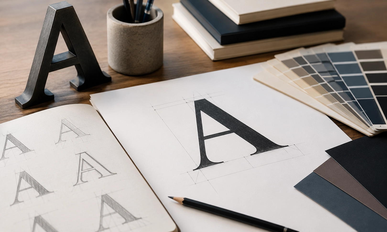
Serif fonts have small decorative strokes at the ends of letters. They are often associated with tradition, reliability, and professionalism.
Sans-Serif Fonts
Clean and modern, sans-serif fonts are widely used in digital branding. They convey simplicity, clarity, and innovation.
Script Fonts
These fonts mimic handwriting and often feel elegant, creative, or personal. They are commonly used in lifestyle or luxury brands.
Display Fonts
Display fonts are designed to attract attention using a bold and distinctive look. Therefore, they should be used for branding purposes, such as a headline, a header or a logo.
Choosing the appropriate font combinations is a crucial step in creating effective brand identity typography.
Key Factors to Consider When Choosing Typography
Selecting the right fonts requires more than just personal preference. Here are some important considerations.
1. Align with Brand Personality
When choosing typography for your brand should reflect the tone and values of your brand. A technology brand will typically choose clean, modern fonts. On the other hand, a luxury brand would select more elegant typography.
However, both brands need to be aligned with their brand's style including their visual components and message via typography as this alignment will help create consistency.
2. Prioritize Readability
No matter how stylish a font looks, it must be easy to read. Poor readability can negatively impact user experience and reduce engagement.
A well-structured brand guide typography ensures that fonts are used appropriately across different formats and devices.
3. Maintain Consistency
Consistency is key in branding. Using too many fonts can make your brand look unprofessional and confusing.
Most brands stick to 2–3 fonts:
One for headings
One for body text
Optional accent font
This approach strengthens typography in branding and keeps your visual identity cohesive.
4. Consider Digital and Print Compatibility
Your typography must be compatible in both digital and print formats. Some fonts can look good when viewed online but do not always convert well to printed materials.
The same applies to establishing your own brand identity typography. It is important that typography matches across multiple platforms.
5. Create a Typography Hierarchy
The way in which typography guides reader attention is known as typographic hierarchy, where the styles and structure of different text elements (heading, subheading, body) helps to guide the reader’s attention through a page.
A typographic hierarchy provides clarity to the reader and reaffirms your brand guide typography, thereby making it easier for the reader to navigate the content.
The Role of Typography in Brand Consistency
Brand consistency is highly dependent upon proper use of typography. A well-defined brand guide typography will outline several things, like:
1. Font styles and sizes
2. Line and letter spacing
3. How to use typography across different platforms
By following these guidelines, businesses can ensure that all typography in branding is consistent throughout various brand touchpoints and thereby reinforce brand trust and brand recognition.
Common Mistakes to Avoid
Brands with strong identities can also have typography issues. These typography mistakes include:
Using too many fonts
Choosing style over readability
Ignoring responsiveness for mobile devices
Not using fonts consistently across all platforms
Avoiding these mistakes will help keep your brand identity typography strong and have a polished look.
Conclusion
Although typography may play a subtle role within branding, it possesses substantial power through its ability to create initial brand impressions, as well as reinforce your brand's identity. Thus, having the proper typography will have an enormous effect on how your audience perceives your company.
Considering readability, consistency, and alignment with brand personality can help businesses make smarter decisions about choosing typography for your brand. A clearly defined set of guidelines for your typography will enhance the overall visual appeal of your brand while also providing it with a cohesive and professional look.
As a result, by utilizing effective typography in branding, you will develop a strong, recognizable, and long-lasting identity for your brand – one that will build trust with your customers.
FAQs
1. How does typography in branding influence the way people perceive a business?Typography in branding is the silent voice of a company. It communicates a brand’s personality, values, and tone before the text is read. Typography is important to build brand recognition. It evokes feelings like trust and establishes credibility through visual identity.
2. What should a brand guide typography section include for consistency across all platforms?
A brand guide typography section should define primary and secondary fonts, font weights, and specific usages. This ensures visual consistency. It should include font hierarchy, line and letter spacing, and guidelines for print and digital channels. Consistent typography improves readability and makes for a professional, cohesive branding.
3. How do you go about choosing typography for your brand without making it look generic?
Choosing typography for your brand depends on what message or visual you are trying to convey. Rule of thumb is that you don’t choose something generic that leads your brand to get lost in a sea of similar logos. Apply a strategic approach when choosing typography. Look into the psychology of your target audience, what your brand’s personality is, and the technical application required.
4. How does brand identity typography help businesses create a last visual impression?Brand identity typography creates a lasting visual impression by conveying the brand’s personality, emotion, and tone before the text has been read. It strengthens brand recognition by being consistent across all platforms. When a typography is well-done, the brand’s logo and name become easy to recall and distinguish from competitors.
5. Can the wrong typography in branding hurt a company’s credibility?
Poor typography in branding can make a great business look unprofessional. Mismatched fonts, hard-to-read typefaces, or inconsistent usage across platforms can confuse your audience and weaken trust. That’s why investing time in brand typography early on saves you from costly rebranding later.