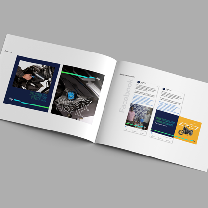
Defining a unique visual language for a new brand of two wheeler within the EV segment

Brand Architechture + Guidelines

In a nutshell

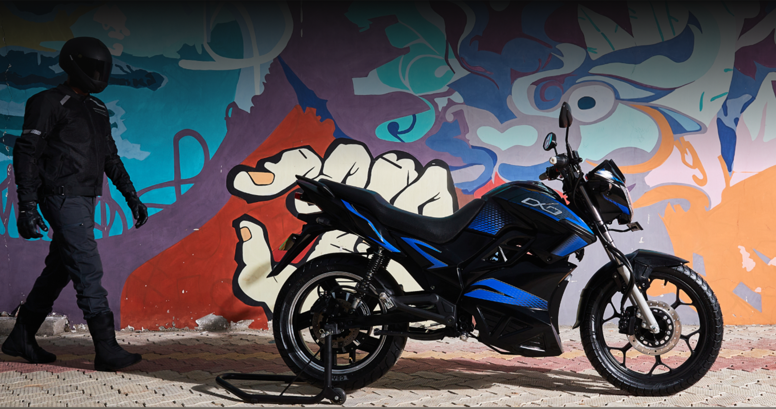
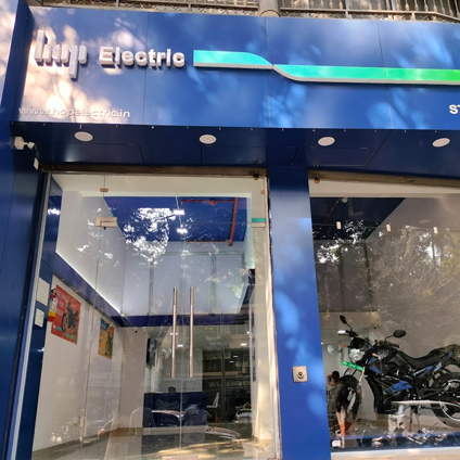
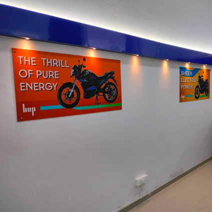
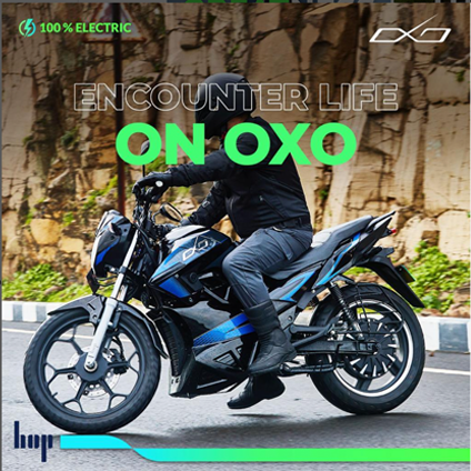
Mobility space in particular in the EV segment seemed to be cluttered with similar propositions. The category needed a strong visual representation of both the power and mileage besides having the EV attributes like environmentally friendliness. The visual design of the brand has been created in a manner that has movement, dynamism along with the liberty of flexible usage an important aspects considering the brand will be visible through its communications largely in the digital medium.

The joy of hopping
Electric is the key category driver


Powered by energy derived from electric power. Cable as a graphic form is used to depict electric and HOP is the brand that delivers movement, commute, freedom etc. attributes

Move better

Electrified Riding Experience

Redefining the motorcycling experience, Hop OXO is powered by state of the art 72 V “eFlow electric powertrain” for a ride so smooth that you will feel like riding an air carpet. No Noise. No Vibrations. No Pollution.

THE THRILL OF
PURE ENERGY.